Will,
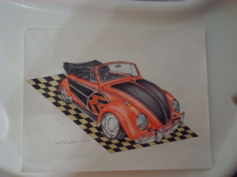
Looks like you're off to a good start. The biggest piece of advice I can give you is to draw, draw, draw. Tracing is a good way to get a general perspective down or at least understand how it works.
Here's my critique, I'm sure others will want to add:
3 toughest parts of car drawing and rendering- 1. perspective, 2. ellipses, 3. shine/glass.
-Your perspective looks pretty good.
-Ditch the checkerboard background, it's distracting. Try doing one more faded.
-Paint schemes look good, that's a subjective thing anyway. (not sure about the blue and yellow)
-You give the appearance of shine with high levels of contrast, these look a little flat to me
-By adding white "hot spots" for highlights, that may make it pop more
-Chrome is extremely difficult, anything facing up gets cool colors, anything facing down reflects ground surface
-The VW has a couple perspective issues with the wheel ellipses, the front needs to be tilted a little counter clockwise, the back looks like it's folding under
-reflections on the bumpers (GTX and Chevelle) need some more work
-study actual photographs of cars in different settings to see how the surface reflects objects and light.
-Same thing with glass, it's highly reflective and the tough part is that it's transparent. You should be able to see inside even if it's tinted
Hope this helps, you just need to analyze how cars really look. Copy photos, copy other renderings. Read How to Draw books, look for rendering tutorials online.
A great book to start with is by Thom Taylor called "How to Draw Cars Like a Pro".
www.cardesignnews.com also has some good online tutorials to check out.
Good luck and keep posting work!


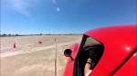 Brian Hobaugh SCCA National Tour June 2014
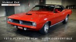 First Hemi 'Cuda Convertible Ever Built
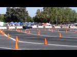 Short clips: Goodguys Pleasanton autocross and pit videos


 '71 datsun 510


 Hybrid Mode
