As a new member, I'd like to get your thoughts on the website I created for my father's '69 Camaro RS/SS. It's not necessarily "artwork" per se, but i built the site from the ground-up: photography, photoshop work and coding (Dreamweaver actually). The only thing that isn't mine is the sound (it's actually a '57 Chevy wav file I swiped from some freebie site). There's not much to it right now as it's a work-in-progress started in '06. Here's the link...
http://home.comcast.net/~rickh20136/


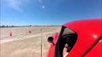 Brian Hobaugh SCCA National Tour June 2014
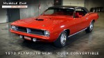 First Hemi 'Cuda Convertible Ever Built
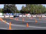 Short clips: Goodguys Pleasanton autocross and pit videos


 Threaded Mode