Second and third YG. The reason being is they are different. Second reminds me of the Yenko graphic and the third because it is subtle. I believe, that if you ad a thin edge (but thicker than you have in #2) of white around the black graphics on both designs and possibly taper off towards the back of each graphic. As for number four...if you reshape the thick part of the back of the graphic to match the rear fender lines...would look very cool! Outline again with white.


That is my take. Good luck with your decisions.
DV


 Brian Hobaugh SCCA National Tour June 2014
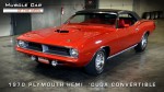 First Hemi 'Cuda Convertible Ever Built
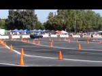 Short clips: Goodguys Pleasanton autocross and pit videos


 Linear Mode

