It looks great so far! Very appealing. I agree that the red mixes too much with the "G", but I also think that the G has to stay the same color from front to back. (And the red looks great with the black background BTW.) Out of the process of elimination have you thought about changing the color of the car just to see how it looks? Or even white with red stripes to keep the color combination? I did that on a flier I was working on (used my car but changed it's color).
Using a curved track for the background was also something I was working on with my old website logo/banner, but it was too difficult for me to get it to look good. But I was thinking for this that a single swoop or curve (from the corner of the bottom windshield) on the left hand side in the opposite direction may balance it out as well.
__________________
'85 F-41
'86 Camaro
|


 Brian Hobaugh SCCA National Tour June 2014
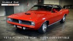 First Hemi 'Cuda Convertible Ever Built
 Short clips: Goodguys Pleasanton autocross and pit videos


 Threaded Mode